
How to design your product packaging for 2020/21
Making sure your product stands out from the competition is vital - but how is it done? Let’s take a look at the best methods for designing strong packaging!
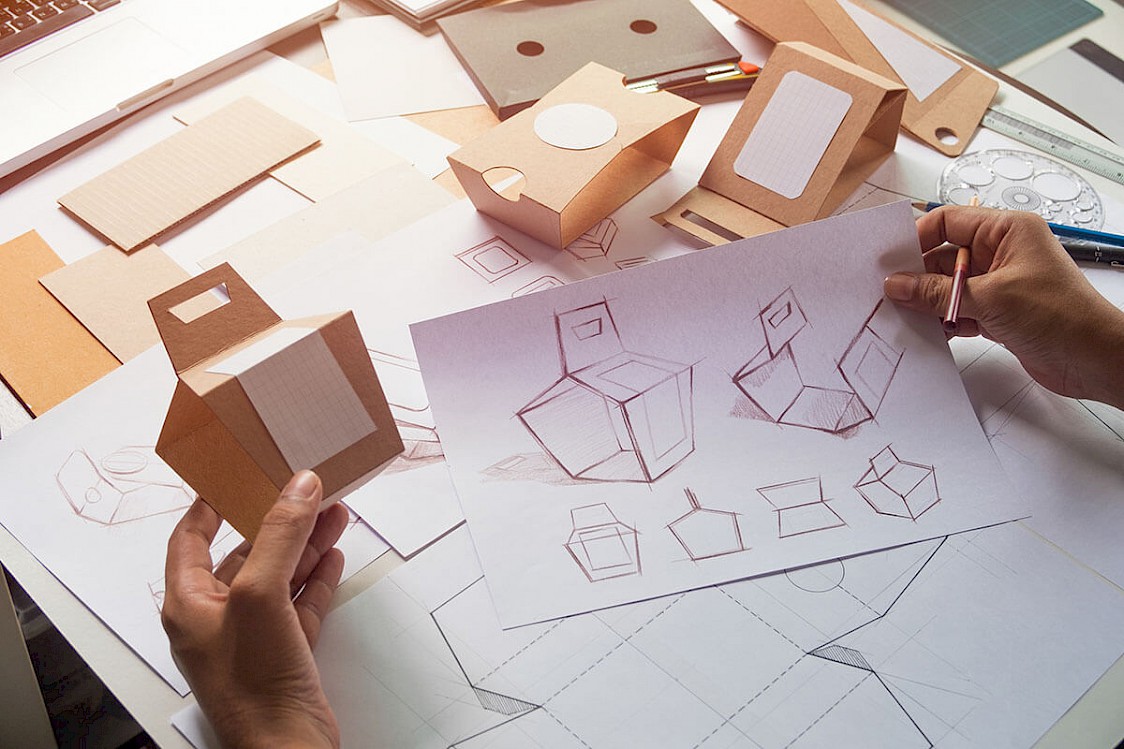
Designing product packaging takes a range of different factors from the shape and size needed, to the marketing material that’s displayed on the exterior. We’ve written this guide to take a deep dive into the different aspects of what’s involved and what we can do to take your ideas from the drawing board to the shelf and into your customers hands.

Contents:
There is a lot that goes into the perfect packaging for your product. It’s not as simple as throwing a sticker on a cardboard box but instead requires an investment of time to make sure that it not only aligns with your product but also making sure that it falls inline with your business and it’s branding. It can be a time consuming process - and that’s why we have our dedicated team of in-house packaging design experts that are ready to help take your project from idea to reality and deliver a solution to packaging your product that will ensure it stands out against the competition on the shelf. It’s also the first impression your customers will get of your business - so make sure that it portrays everything about your brand and the product that’s important.
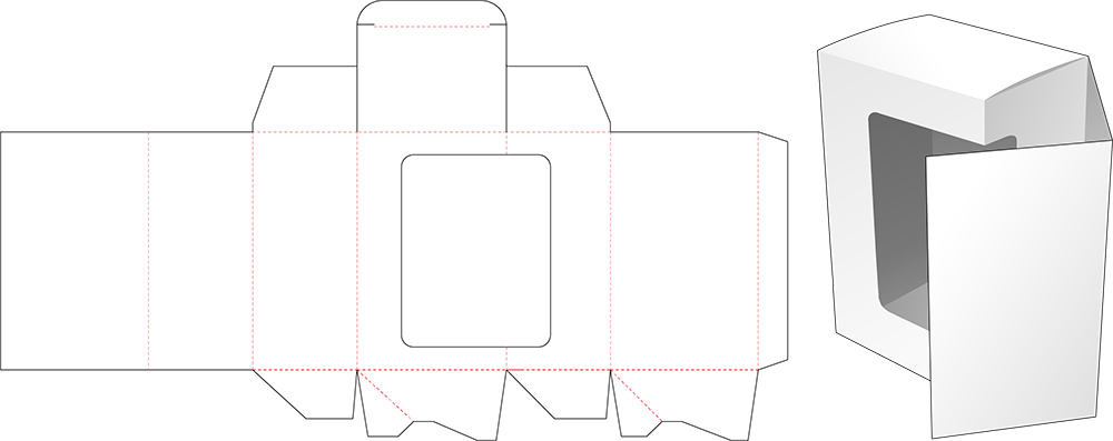
Die lines give you an important visual when designing your packaging for where you can show graphics and where there needs to be room for the structure to be made from. For example, in a foldable box, you’ll often have a blueprint like the one shown below that outlines areas that can be used to design whilst also demonstrating where the folds will occur to create the packaging solution once it’s ready to house the product. They give you a clear indication of the size and dimensions of the packaging as well so you can accurately build and design it to fit your product perfectly. You can see them in every packaging type there is today - try taking a box from your kitchen cupboard and unfold it at the joins, you’ll likely see the different fold lines where tabs cross over each other forming the structure.

It’s all too common today to consider packaging products in a square box. Whilst this might be a good idea making sure that you can neatly store them and transport them easier - it’s not always the best choice if you’re looking to stand out from your competition on the shelf or need something a little more bespoke to house your product and protect it in transport. Consider a cake for example, the packaging needed for this needs to more or less fit the size and shape of the cake perfectly - otherwise when the customer receives it it’ll likely not look anything like how it left your shop due to it being knocked around in transport. To solve this, you might want to go for a cylindrical shape with a plastic wrapping on the inside to protect it. Make sure you take these factors into consideration and remember not to always default to designing your solution from a box.
There is designing the actual packaging itself, but it’s no good if you don't have any way of closing it off and keeping your product secure inside. You’ll need to ensure that the solution you’re using has a way of sealing the ends where you put your product in. At Bell Packaging, these would be our Jetlok® End Caps. These do an excellent job fitting to our different Retran® & Jetran®/Jetbox® solutions - which as a bonus are made from post consumer waste! There are many different forms of closures, you’ll need to take into consideration whether or not this packaging is likely going to be used over and over again and this would need sealing back up. An example of this could be a box of screws. You’d want to only use one screw and close the box again but having tabs you need to rip off to get in wouldn’t allow you to close the box again.
Once you have your idea in mind, it’s time to create some mockups of the design you want to see come to life. Taking the different factors we’ve covered so far, you’ll take your idea to a designer - like our packaging design serivce - and go over what your product is and the ideas you have. From here, mockups will be created inline with your branding and product. This stage gives you a really good idea of how the packaging is going to look with the graphics and layout.

In a world where we are pushing to use less and less plastic, many brands now are opting to use recycled materials to create their packaging. Not only is this good for the environment, but it also builds trust and loyalty amongst your customers as people are more likely to buy products that use recycled materials over the competitors equivalent. That’s why at Bell Packaging, we strive to keep pushing our production to keep developing better materials that fall inline with our environmental policies.
It’s not always what’s on the outside that counts thought - the inside matters too! Materials used on the inside of your packaging are just as important as the exterior. If you have a product which is likely to move around in transit, you’d want to wrap it in a material like bubble wrap, or even better, some recycled tissue/brown paper to keep it in place and avoid damaging it.
Before your packaging is ready to be printed, it’s important to get some mockups completed. This makes sure that everything is printed exactly how you’d expect to see it before they are produced at scale to house your products. It’s at this time that you can make small amendments to the way graphics are displayed as well as any text changes because if these are left until further down the line, you’ll incur charges for the changes. When you’re ready to go, the designs will need to be sent to the printers with the correct dimensions and in the correct formats.
If these are all things you need help with, then get in touch with us today and speak with our in-house team of expert product packaging designers to get your project started. We have the ability to cater for your project from start to finish and scale with your business as it grows.