

Inspiration to consider for your product packaging
Thinking of designs for your product packaging can be difficult. So let’s take some inspiration from some of our favourites!
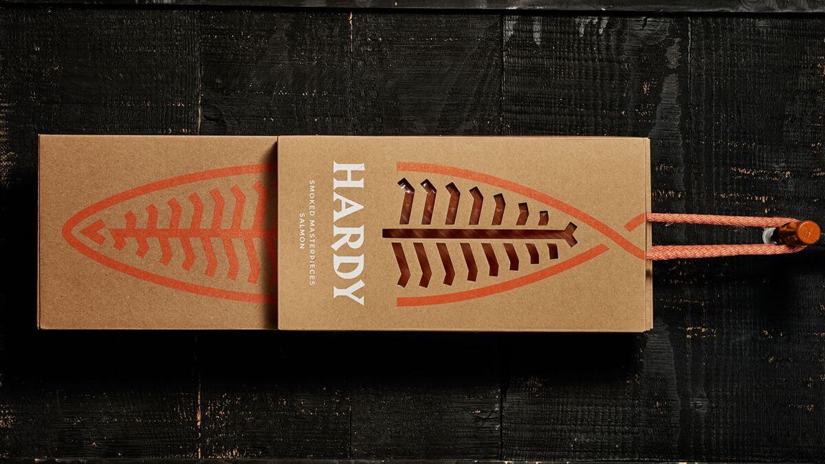
Hardy does a really good job of incorporating a recyclable cardboard outer shell for it’s smoked salmon products. This is coupled with a smart take on a salmon structure on the front of the product with their company name clearly visible. The clear branding leaves ample room on the rear of the product to display food hygiene information (which is required by law in the UK). A small piece of string is attached to the top of the solution which gives the user easy access to slide the contents out. A well thought out and executed combination of bold branding and customer experience consideration.
Why custom packaging is essential
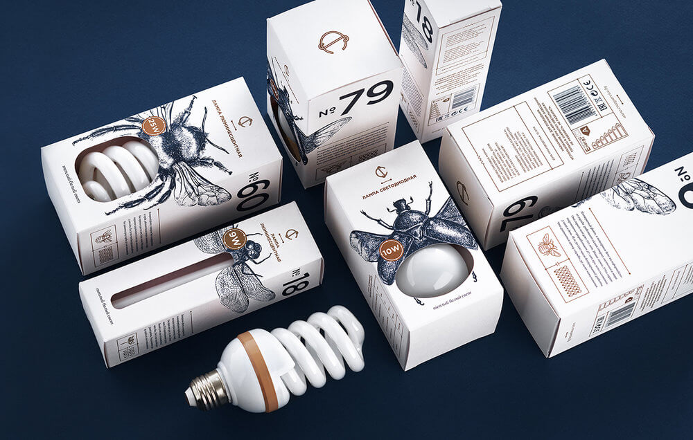
In one of our previous articles titled ‘How to choose the right packaging for your product’ we spoke about using a clear window to see through into your product. CS Light Bulbs do a really good job of this by using the bulb in the box as part of the image of the bee from their branding. It gives the customer a look at the product without losing any visual aesthetic and leaves a lasting impression on anyone who would see it on the shelf.
"First impressions may seem trivial and insignificant, but they last. It takes as little as 3 seconds to form an opinion of a product."
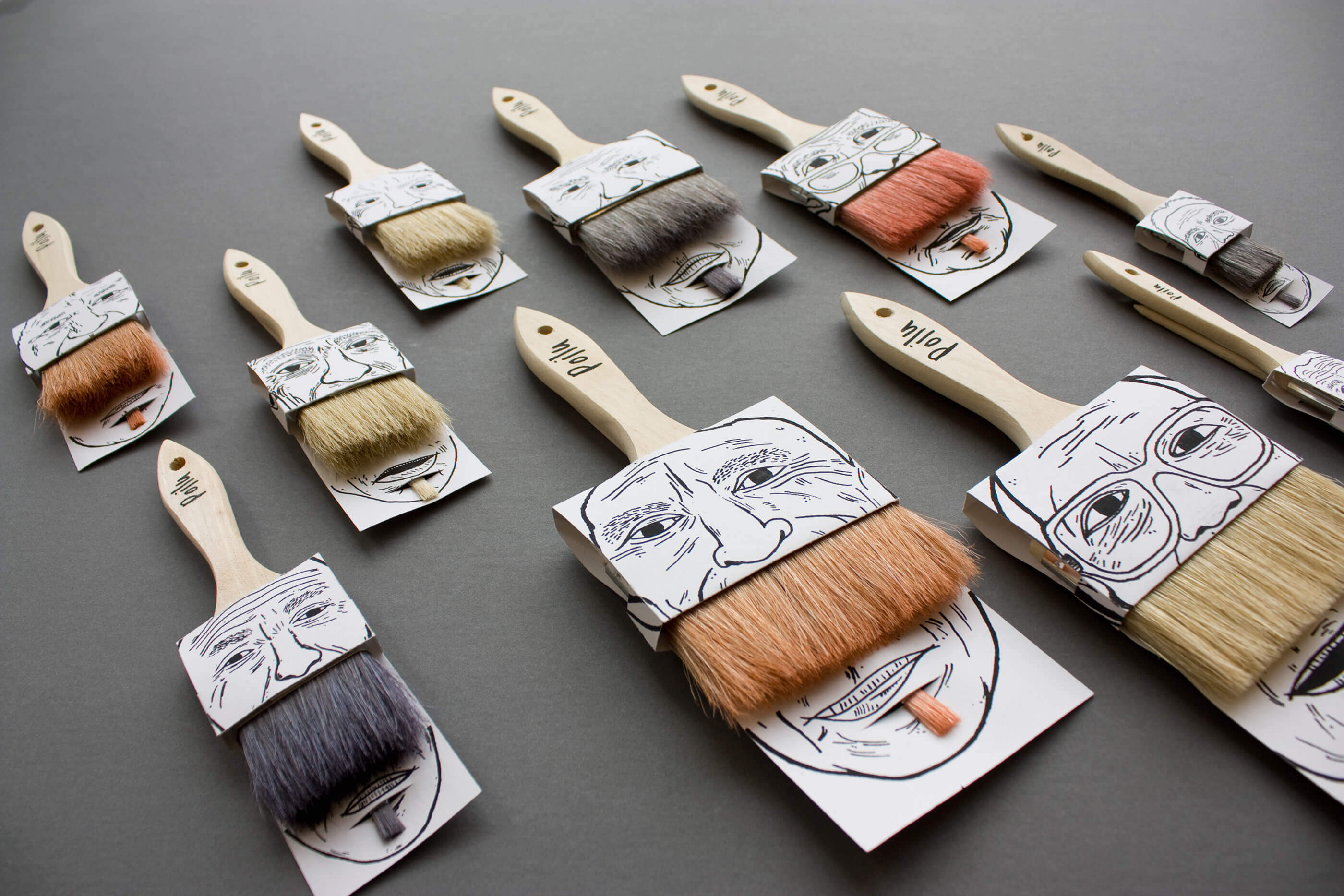
Sometimes simple can be the best solution. Poilu Paintbrushes definitely pull this off by again using the product as part of the packaging design with the paintbrush being used as a beard. This clever use of the product would draw people to buy this paint brush over the competitor if it was seen hanging next to them on the wall. The solution here gives potential customers a look at the product as well as more information in the rear.
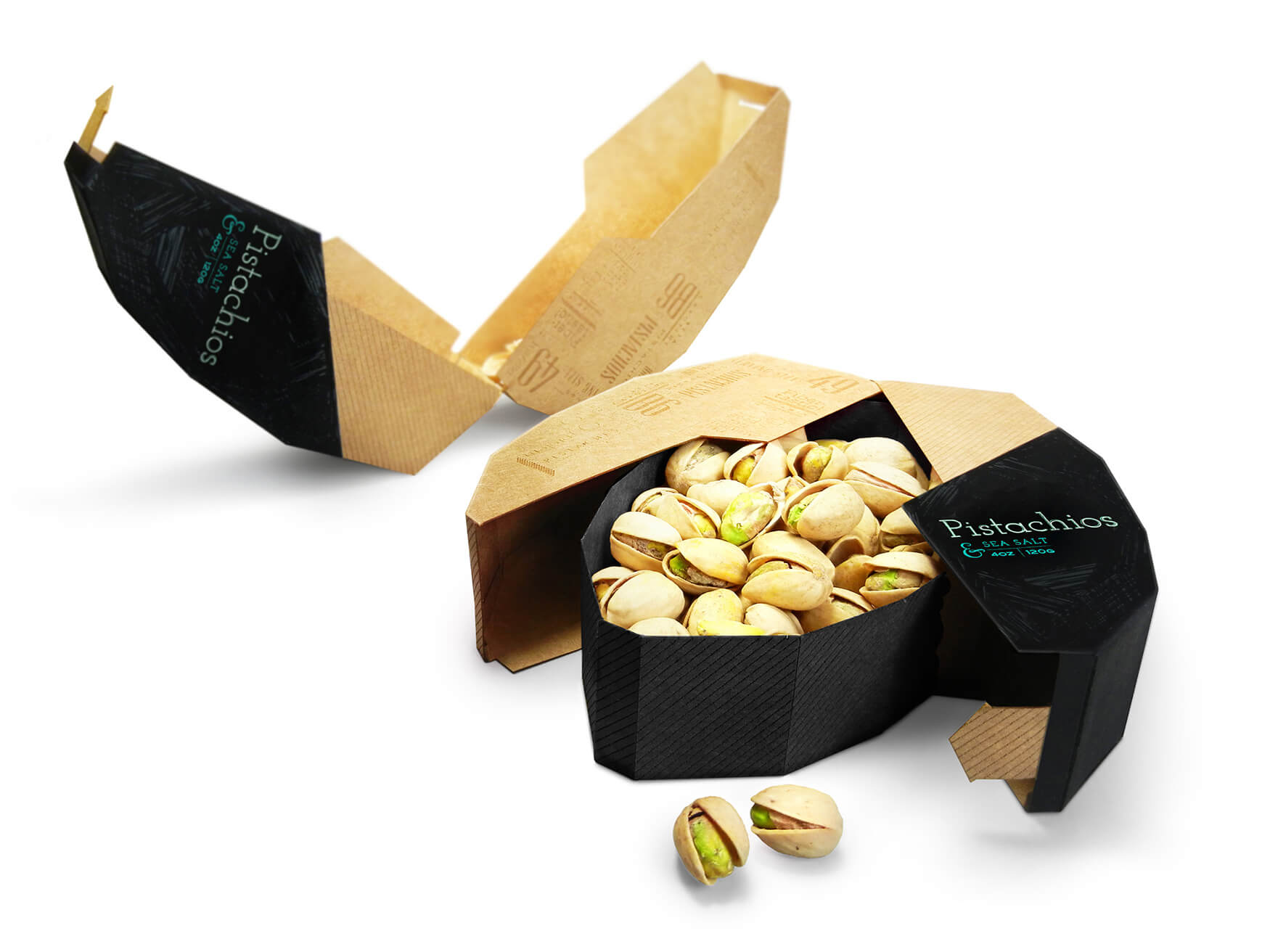
If there is one example in this list to take quality from - it’s Mighty Nuts. This packaging perfectly embraces the product it’s holding and does a really good job of creating a solution that is going to stand out very well against the other competitors. It’s modern, eco-friendly look showcases the quality and thought that has gone into how the product is created which for many people will demonstrate the care and attention to the product as well.
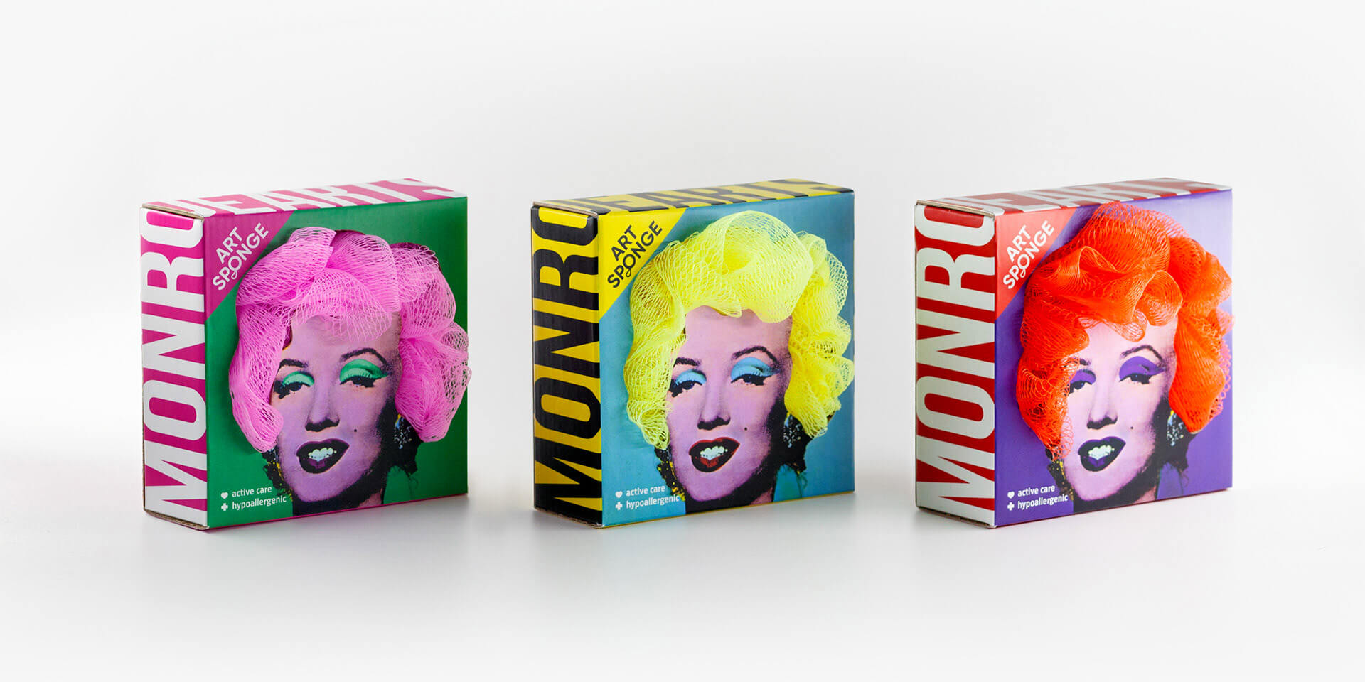
Another very good use of the product in the packaging design can be found in the design for Art Sponges. They use the sponge product as the hair from various celebrities which gives a fun and quirky look to the brand. The bright colours and bold lettering will make the packaging stand out amongst the other sponges available in the market - some of which often don’t have any outer packaging at all!
Our in-house design specialists have a wealth of experience designing and producing a wide variety of different product packaging styles catering for every type of product you can think of. Get in touch with us today to tell us about your product and we’ll be excited to get to work with you bringing your ideas to life. When it's time to produce your solution, we have the capabilities to scale with your business and continue to deliver high quality packaging to fit your brand.